
Our entire house was painted in a light cream color, walls and ceilings. (The basement, refinished later, was painted mostly a soft yellow.) It’s time to add color.
Who knew that color could be so confusing?
For the first time, we asked for help from a decorator. She made suggestions that surprised us, but we agreed: a dark accent wall in the living room and gray on the walls. (So trendy!)
I picked out paint chips (with her) and came home to try some samples. Three greys, starting with the darker one she favored, two that I thought were gradient lighter tones,and two dark blues.
This was all happening while a painter did all the ceilings in the living room, kitchen and hallway: ceiling white. We made a snap decision that morning to paint the kitchen because at both entrances, there are no natural divides where one paint could end and another start. This complicated our color choices.
 I was really shocked when I painted the samples. It was a bit like Goldilocks and the Three Bears. One color was too dark, one was too light (with strong purple tints), and so on. The accent paints were a deep purple and a too-bright blue.
We waited a day, living with the color and waiting for sunshine, and then went back to the paint store for more samples. Lighter, warm greys and two more dark navies.
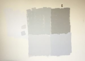
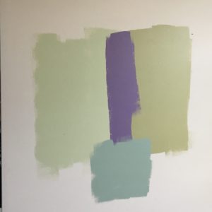
I also bought samples for our master bathroom: a light spring green. Again, the first sample I rolled was surprisingly light; the second dark. When I bought another sample, I was shocked by the blue tint. What was going on?
As a quilter, I consider myself to be good with color. Choosing fabric might be my favoritie part of quilting: There’s nothing like walking through a quilt store with bolts of fabric in your arms, placing them side by side to get the right color. I once took a color class and was the star pupil. One of my blog categories is color.
But this? I felt like someone was doing a bait and switch with every sample!
We’re ready to plunge, which is exactly how it feels. We still don’t know if we will like, love or hate the end result.
P.S. We’ve only chosen the color for the main walls. Want to vote on the accent wall? (Even though the picture doesn’t really tell an accurate story either. The one on the top right is actually a dark purple/blue. The other three are closer to reality.)
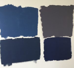

Ugh. This stuff is scary. That fear would cause me to go with whatever color is the lightest, which, to me, looks like the top left color. But, I don’t trust myself to even vote!
I’m not going to go down that path! I trust your instincts. Hats off to you both for all the time and energy you’re putting into this place.
Based on my experience with our decorator, I would guess that she chose the upper right color. Grays seem to be the most trendy color nowadays. We were also a bit shocked when the walls are painted but after a while everything settles down and seems good. Good luck and God bless you on your choices.
Wish we had talked paint color the other week when we met! I’ve just been through this…the colors were finally chosen, along with a darker accent wall for both living room and bedroom, the project is done, but did it turn out as I’d hoped? Nooooo….but I’ll have to live with it! Years ago we painted off-white, blue, yellow, green, pink or beige. HA, not now! There has to be at least 2.5 million choices. A wise friend said, remember the walls are just the background of a room, your decor choices are what will define the room. Wishing you much joy but less confusion as you delve in, Chris!
Very pale beige walls and light beige rugs makes everything easy to compliment- off white couch and chairs with little accents of dark red and blue plus dark blue velvet recliner is great for my retirement apartment. Lots of colors in my paintings. Nothing new to match my memories. God is good, learning to rejoice in everything (so far). Had a class today on Mendelssohn’s Elijah where he was pleading for rain. We came home in the first snow of the season.